> ## Documentation Index
> Fetch the complete documentation index at: https://cometchat-22654f5b-docs-platform-docs-release.mintlify.site/llms.txt
> Use this file to discover all available pages before exploring further.
# Users With Messages
> Users With Messages — CometChat documentation.
## Overview
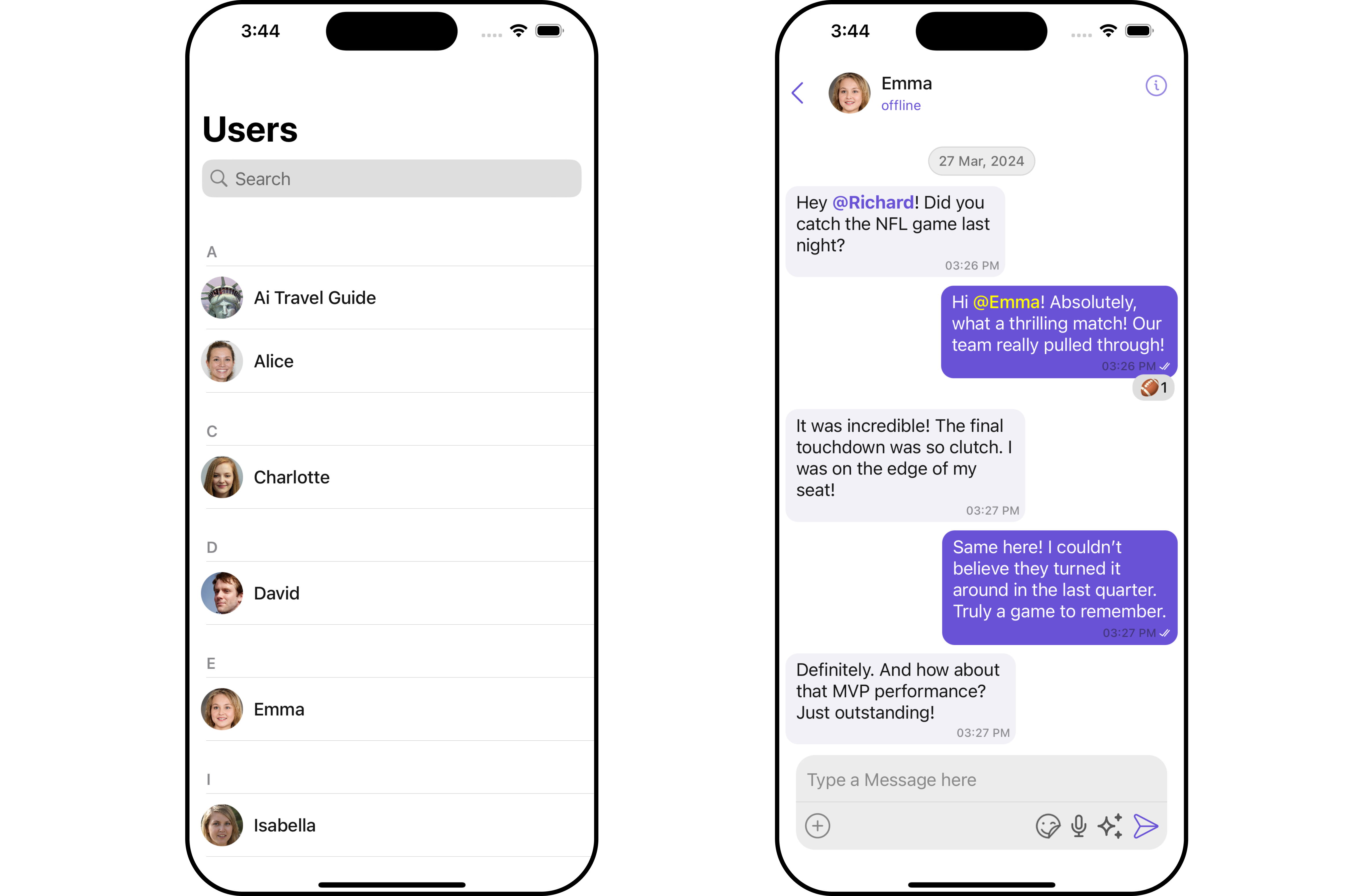
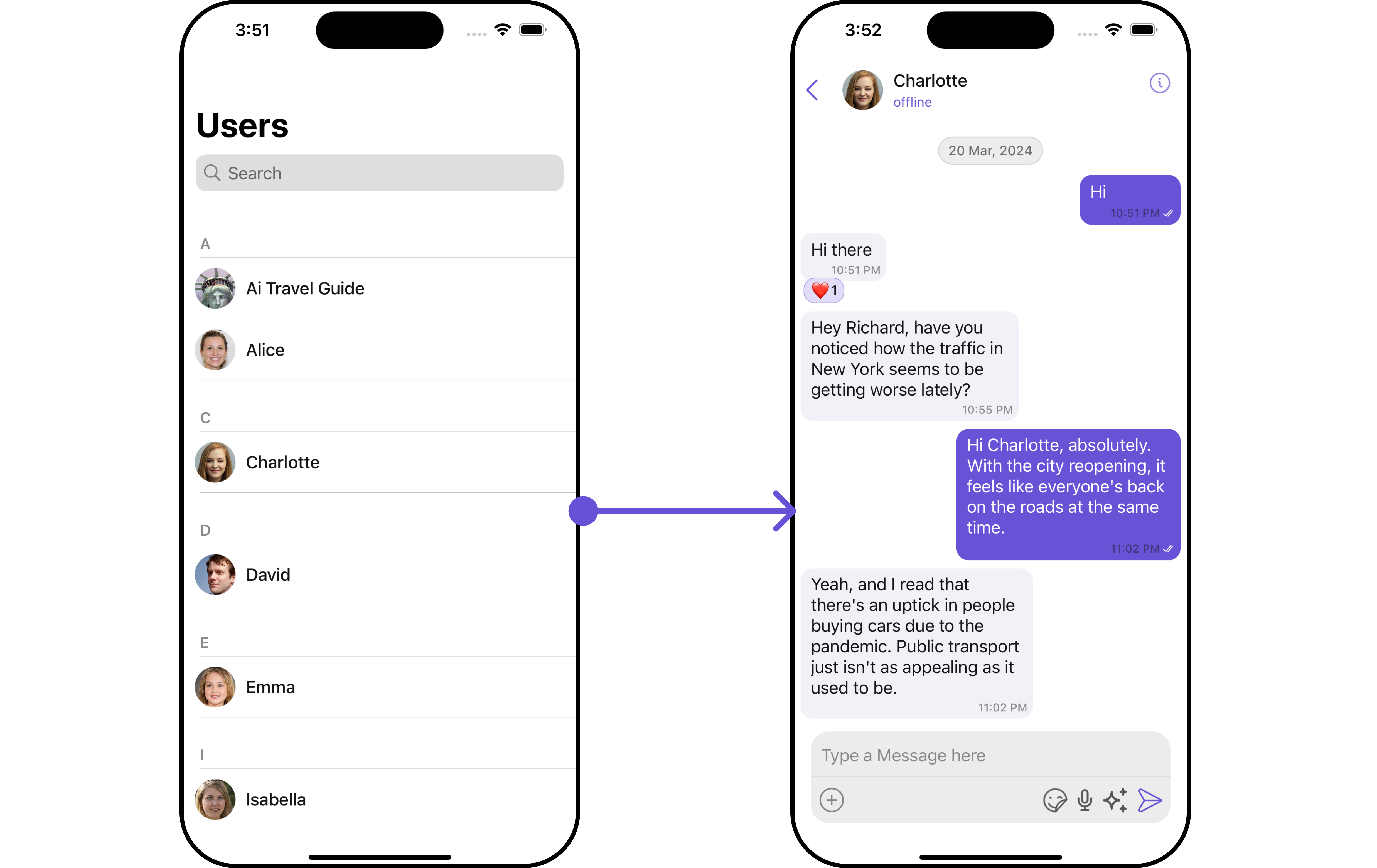
`CometChatUsersWithMessages` is a [Composite Component](/ui-kit/ios/v4/components-overview#composite-components) that seamlessly merges the functionalities of both the [Users](/ui-kit/ios/v4/users) and [Messages](/ui-kit/ios/v4/messages) modules. It empowers users to effortlessly navigate to any individual's chat window by simply clicking on their respective **list item** in the user list.
Additionally, `CometChatUsersWithMessages` inherits and encompasses all attributes available within the `CometChatUsers` module, ensuring a comprehensive user experience.
 | Components | Description |
| ----------------------------------- | ------------------------------------------------------------------------------------------------------------------------------------------------------------------------------------------------------------------------------------------------------------------------------------------------------------------------ |
| [Users](/ui-kit/ios/v4/users) | `Users` serves as a standalone component designed to establish a screen displaying a list of `users`, providing them with the capability to search for specific individuals. This component operates as a container, inheriting from `CometChatListBase`, and serves as a wrapper for the `CometChatUserList` component. |
| [Messages](/ui-kit/ios/v4/messages) | `Messages` presents the chat interface for both individual `users` and `group` entities. It exhibits a message list containing all interactions where the loggedInUser has sent or received messages from any of these entities. |
## Usage
### Integration
Since `CometChatUsersWithMessages` is a view controller, it can be launched either by a button click or through any event's trigger. It inherits all the customizable properties and methods of `CometChatUsers.`
**View Controller**: To use **CometChatUsersWithMessages** in your `view controller`, use the following code snippet.
```swift view controller theme={null}
let cometChatUsersWithMessages = CometChatUsersWithMessages()
let naviVC = UINavigationController(rootViewController: cometChatUsersWithMessages)
self.present(naviVC, animated: true)
```
***
### Actions
[Actions](/ui-kit/ios/v4/components-overview#actions) dictate how a component functions. They are divided into two types: Predefined and User-defined. You can override either type, allowing you to tailor the behavior of the component to fit your specific needs.
##### 1. SetOnItemClick
The `setOnItemClick` method is used to override the onClick behavior in **CometChatUsersWithMessages**. By default, this action has a predefined behavior which navigates to the **messages**. However, you have the flexibility to override this event and tailor it to suit your needs using the following code snippet.
```swift theme={null}
let cometChatUsersWithMessages = CometChatUsersWithMessages()
.setOnItemClick { user, indexPath in
//Perform Your Actions
}
```
##### 2. SetOnItemLongClick
This method `setOnItemLongClick`, empowers users to customize long-click actions within **CometChatUsersWithMessages**, offering enhanced functionality and interaction possibilities.
```swift theme={null}
let cometChatUsersWithMessages = CometChatUsersWithMessages()
.setOnItemLongClick { user, indexPath in
//Perform Your Actions
}
```
##### 3. SetOnBack
This method allows users to override the onBack Pressed behavior in **CometChatUsersWithMessages** by utilizing the `setOnBack` , providing customization options for handling the back action.
By default, this action has a predefined behavior: it simply dismisses the current view controller. However, the flexibility of CometChat UI Kit allows you to override this standard behavior according to your application's specific requirements. You can define a custom action that will be performed instead when the back button is pressed.
```swift theme={null}
let cometChatUsersWithMessages = CometChatUsersWithMessages()
.setOnBack {
//Perform Your Actions
}
```
##### 4. onError
This method `setOnError`, allows users to override error handling within **CometChatUsersWithMessages**, providing greater control over error responses and actions.
```swift theme={null}
let cometChatUsersWithMessages = CometChatUsersWithMessages()
.setOnError { error in
//Perform Your Action
}
```
### Filters
**Filters** allow you to customize the data displayed in a list within a Component. You can filter the list based on your specific criteria, allowing for a more customized. Filters can be applied using RequestBuilders of Chat SDK.
While the UsersWithMessages component does not have filters, its components do, For more detail on individual filters of its component refer to [Users Filters](/ui-kit/ios/v4/users)[Messages Filters](/ui-kit/ios/v4/messages)
By utilizing the [Configurations](#configurations) object of its components, you can apply filters.
In the following **example**, we're sorting `Users` by `UID's` and setting the `limit` to 10 using the `usersRequestBuilder`.
```swift theme={null}
let usersRequestBuilder = UsersRequest.UsersRequestBuilder(limit: 20).set(UIDs: ["emma-uid"])
let cometChatUsersWithMessages = CometChatUsersWithMessages(usersRequestBuilder: usersRequestBuilder)
let naviVC = UINavigationController(rootViewController: cometChatUsersWithMessages)
self.present(naviVC, animated: true)
```
make sure to `import CometChatSDK`
***
### Events
[Events](/ui-kit/ios/v4/components-overview#events) are emitted by a `Component`. By using event you can extend existing functionality. Being global events, they can be applied in Multiple Locations and are capable of being Added or Removed.
The `UsersWithMessages` does not produce any events but its component does.
***
## Customization
To fit your app's design requirements, you have the ability to customize the appearance of the UsersWithMessages component. We provide exposed methods that allow you to modify the experience and behavior according to your specific needs.
### Style
Using **Style** you can **customize** the look and feel of the component in your app, These parameters typically control elements such as the **color**, **size**, **shape**, and **fonts** used within the component.
##### 1. UsersWithMessages Style 🛑
You can set the `UsersWithMessagesStyle` to the `UsersWithMessages` Component to customize the styling.
**Example**
```swift theme={null}
let usersWithMessagesStyle = UsersWithMessagesStyle()
.set(messageTextColor: .red)
.set(messageTextFont: .italicSystemFont(ofSize: 6))
.set(background: .yellow)
.set(borderColor: .green)
let usersWithMessagesConfiguration = UsersWithMessagesConfiguration()
.set(style: usersWithMessagesStyle)
let cometChatUsersWithMessages = CometChatUsersWithMessages()
```
You can also customize its component styles. For more details on individual component styles, you can refer [Users Styles](/ui-kit/ios/v4/users) and [Messages Styles](/ui-kit/ios/v4/messages).
Styles can be applied to SubComponents using their respective configurations.
### Functionality
These are a set of **small functional customizations** that allow you to **fine-tune** the overall experience of the component. With these, you can **change text**, set **custom icons**, and toggle the **visibility** of UI elements.
UsersWithMessages component does not have any available functionality.
***
### Advanced
For advanced-level customization, you can set custom views to the component. This lets you tailor each aspect of the component to fit your exact needs and application aesthetics. You can create and define your own views, layouts, and UI elements and then incorporate those into the component.
By utilizing the [Configuration](#configurations) object of each component, you can apply advanced-level customizations to the `UsersWithMessages`.
**Example**
```csharp theme={null}
// Create an object of UsersConfiguration
let usersConfiguration = UsersConfiguration()
//pass your custom error view
usersConfiguration.set(errorView: UIView)
```
**Usage**
Utilize the provided code snippet to instantiate a `CometChatUsersWithMessages` component and configure it with a `UsersConfiguration` object. This ensures seamless integration and optimal functionality within your application.
```csharp theme={null}
let cometChatUsersWithMessages = CometChatUsersWithMessages()
.set(usersConfiguration: usersConfiguration)
```
To find all the details on individual Component advance customization you can refer, [Users Advance](/ui-kit/ios/v4/users#advanced) and [Messages Advance](/ui-kit/ios/v4/messages#advanced).
UsersWithMessages uses advanced-level customization of both Users & Messages components to achieve its default behavior.
1. UsersWithMessages utilizes the [SetMenu](/ui-kit/ios/v4/users) function of the `Users` subcomponent to navigate the [User](/ui-kit/ios/v4/users) to [Messages](/ui-kit/ios/v4/messages)
| Components | Description |
| ----------------------------------- | ------------------------------------------------------------------------------------------------------------------------------------------------------------------------------------------------------------------------------------------------------------------------------------------------------------------------ |
| [Users](/ui-kit/ios/v4/users) | `Users` serves as a standalone component designed to establish a screen displaying a list of `users`, providing them with the capability to search for specific individuals. This component operates as a container, inheriting from `CometChatListBase`, and serves as a wrapper for the `CometChatUserList` component. |
| [Messages](/ui-kit/ios/v4/messages) | `Messages` presents the chat interface for both individual `users` and `group` entities. It exhibits a message list containing all interactions where the loggedInUser has sent or received messages from any of these entities. |
## Usage
### Integration
Since `CometChatUsersWithMessages` is a view controller, it can be launched either by a button click or through any event's trigger. It inherits all the customizable properties and methods of `CometChatUsers.`
**View Controller**: To use **CometChatUsersWithMessages** in your `view controller`, use the following code snippet.
```swift view controller theme={null}
let cometChatUsersWithMessages = CometChatUsersWithMessages()
let naviVC = UINavigationController(rootViewController: cometChatUsersWithMessages)
self.present(naviVC, animated: true)
```
***
### Actions
[Actions](/ui-kit/ios/v4/components-overview#actions) dictate how a component functions. They are divided into two types: Predefined and User-defined. You can override either type, allowing you to tailor the behavior of the component to fit your specific needs.
##### 1. SetOnItemClick
The `setOnItemClick` method is used to override the onClick behavior in **CometChatUsersWithMessages**. By default, this action has a predefined behavior which navigates to the **messages**. However, you have the flexibility to override this event and tailor it to suit your needs using the following code snippet.
```swift theme={null}
let cometChatUsersWithMessages = CometChatUsersWithMessages()
.setOnItemClick { user, indexPath in
//Perform Your Actions
}
```
##### 2. SetOnItemLongClick
This method `setOnItemLongClick`, empowers users to customize long-click actions within **CometChatUsersWithMessages**, offering enhanced functionality and interaction possibilities.
```swift theme={null}
let cometChatUsersWithMessages = CometChatUsersWithMessages()
.setOnItemLongClick { user, indexPath in
//Perform Your Actions
}
```
##### 3. SetOnBack
This method allows users to override the onBack Pressed behavior in **CometChatUsersWithMessages** by utilizing the `setOnBack` , providing customization options for handling the back action.
By default, this action has a predefined behavior: it simply dismisses the current view controller. However, the flexibility of CometChat UI Kit allows you to override this standard behavior according to your application's specific requirements. You can define a custom action that will be performed instead when the back button is pressed.
```swift theme={null}
let cometChatUsersWithMessages = CometChatUsersWithMessages()
.setOnBack {
//Perform Your Actions
}
```
##### 4. onError
This method `setOnError`, allows users to override error handling within **CometChatUsersWithMessages**, providing greater control over error responses and actions.
```swift theme={null}
let cometChatUsersWithMessages = CometChatUsersWithMessages()
.setOnError { error in
//Perform Your Action
}
```
### Filters
**Filters** allow you to customize the data displayed in a list within a Component. You can filter the list based on your specific criteria, allowing for a more customized. Filters can be applied using RequestBuilders of Chat SDK.
While the UsersWithMessages component does not have filters, its components do, For more detail on individual filters of its component refer to [Users Filters](/ui-kit/ios/v4/users)[Messages Filters](/ui-kit/ios/v4/messages)
By utilizing the [Configurations](#configurations) object of its components, you can apply filters.
In the following **example**, we're sorting `Users` by `UID's` and setting the `limit` to 10 using the `usersRequestBuilder`.
```swift theme={null}
let usersRequestBuilder = UsersRequest.UsersRequestBuilder(limit: 20).set(UIDs: ["emma-uid"])
let cometChatUsersWithMessages = CometChatUsersWithMessages(usersRequestBuilder: usersRequestBuilder)
let naviVC = UINavigationController(rootViewController: cometChatUsersWithMessages)
self.present(naviVC, animated: true)
```
make sure to `import CometChatSDK`
***
### Events
[Events](/ui-kit/ios/v4/components-overview#events) are emitted by a `Component`. By using event you can extend existing functionality. Being global events, they can be applied in Multiple Locations and are capable of being Added or Removed.
The `UsersWithMessages` does not produce any events but its component does.
***
## Customization
To fit your app's design requirements, you have the ability to customize the appearance of the UsersWithMessages component. We provide exposed methods that allow you to modify the experience and behavior according to your specific needs.
### Style
Using **Style** you can **customize** the look and feel of the component in your app, These parameters typically control elements such as the **color**, **size**, **shape**, and **fonts** used within the component.
##### 1. UsersWithMessages Style 🛑
You can set the `UsersWithMessagesStyle` to the `UsersWithMessages` Component to customize the styling.
**Example**
```swift theme={null}
let usersWithMessagesStyle = UsersWithMessagesStyle()
.set(messageTextColor: .red)
.set(messageTextFont: .italicSystemFont(ofSize: 6))
.set(background: .yellow)
.set(borderColor: .green)
let usersWithMessagesConfiguration = UsersWithMessagesConfiguration()
.set(style: usersWithMessagesStyle)
let cometChatUsersWithMessages = CometChatUsersWithMessages()
```
You can also customize its component styles. For more details on individual component styles, you can refer [Users Styles](/ui-kit/ios/v4/users) and [Messages Styles](/ui-kit/ios/v4/messages).
Styles can be applied to SubComponents using their respective configurations.
### Functionality
These are a set of **small functional customizations** that allow you to **fine-tune** the overall experience of the component. With these, you can **change text**, set **custom icons**, and toggle the **visibility** of UI elements.
UsersWithMessages component does not have any available functionality.
***
### Advanced
For advanced-level customization, you can set custom views to the component. This lets you tailor each aspect of the component to fit your exact needs and application aesthetics. You can create and define your own views, layouts, and UI elements and then incorporate those into the component.
By utilizing the [Configuration](#configurations) object of each component, you can apply advanced-level customizations to the `UsersWithMessages`.
**Example**
```csharp theme={null}
// Create an object of UsersConfiguration
let usersConfiguration = UsersConfiguration()
//pass your custom error view
usersConfiguration.set(errorView: UIView)
```
**Usage**
Utilize the provided code snippet to instantiate a `CometChatUsersWithMessages` component and configure it with a `UsersConfiguration` object. This ensures seamless integration and optimal functionality within your application.
```csharp theme={null}
let cometChatUsersWithMessages = CometChatUsersWithMessages()
.set(usersConfiguration: usersConfiguration)
```
To find all the details on individual Component advance customization you can refer, [Users Advance](/ui-kit/ios/v4/users#advanced) and [Messages Advance](/ui-kit/ios/v4/messages#advanced).
UsersWithMessages uses advanced-level customization of both Users & Messages components to achieve its default behavior.
1. UsersWithMessages utilizes the [SetMenu](/ui-kit/ios/v4/users) function of the `Users` subcomponent to navigate the [User](/ui-kit/ios/v4/users) to [Messages](/ui-kit/ios/v4/messages)
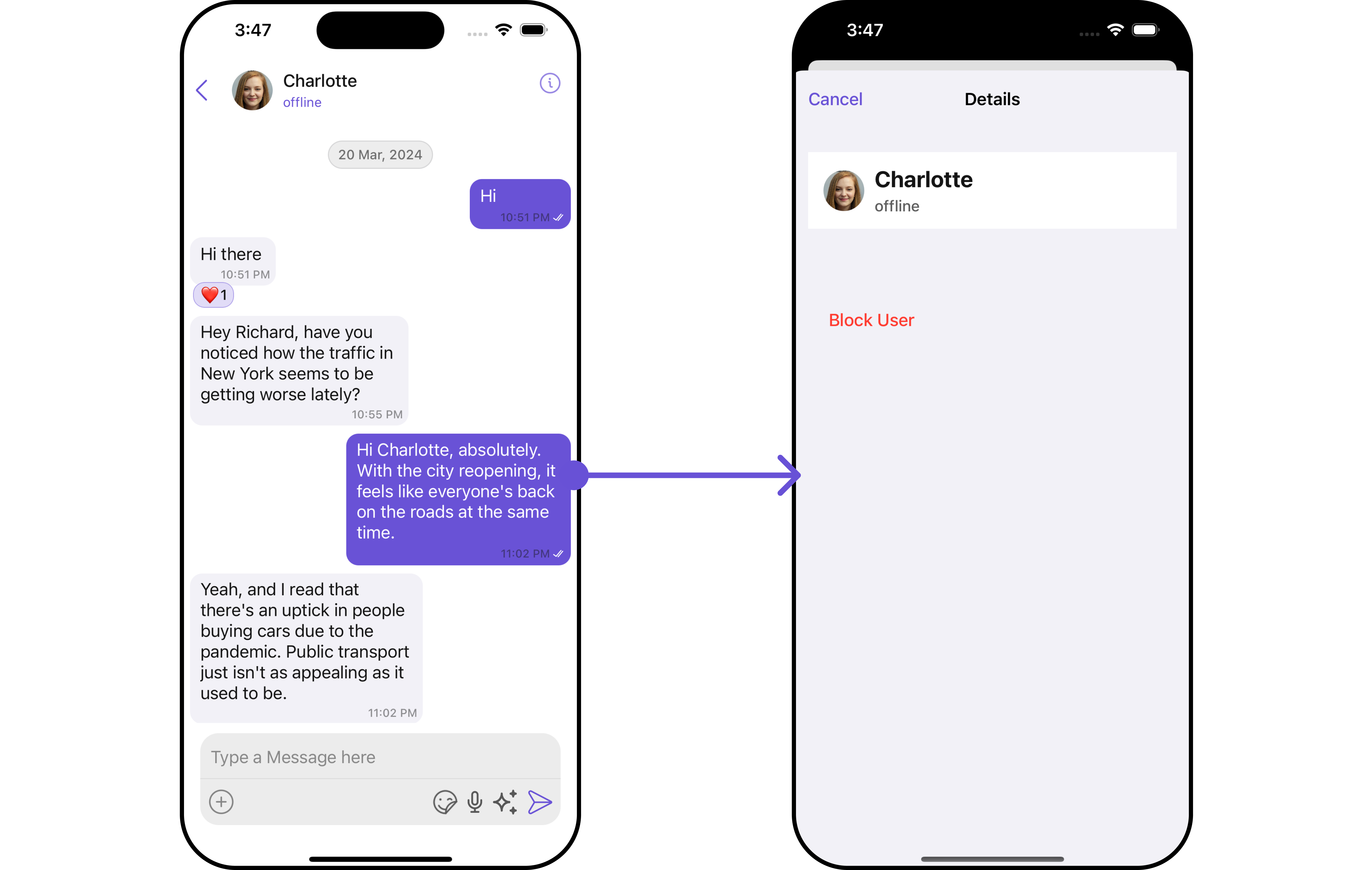
 2. UsersWithMessages utilizes the [SetMenu](/ui-kit/ios/v4/users) function of the `Messages` subcomponent to navigatefrom [Messages](/ui-kit/ios/v4/messages) to Details.
 When you override `.setMenu()`, the default behavior of **UsersWithMessages** will also be overridden.
## Configurations
[Configurations](/ui-kit/ios/v4/components-overview#configurations) offer the ability to customize the properties of each component within a Composite Component.
**UsersWithMessages** has `Users` and `Messages` component. Hence, each of these components will have its individual \`Configuration\`\`.
* `Configurations` expose properties that are available in its individual components.
#### Users
You can customize the properties of the Users component by making use of the UsersConfiguration. You can accomplish this by employing the `.set(usersConfiguration: usersConfiguration)` method as demonstrated below:
```swift theme={null}
let usersConfiguration = UsersConfiguration()
```
**Usage**
The **UsersConfiguration** is utilized within a widget housing `CometChatUsersWithMessages` as a child component. To configure CometChatUsersWithMessages, simply provide the usersConfiguration object using the `.set(usersConfiguration:)` method. This facilitates seamless customization and integration of user-specific settings within the `CometChatUsersWithMessages` component.
```csharp theme={null}
let cometChatUsersWithMessages = CometChatUsersWithMessages()
.set(usersConfiguration: usersConfiguration)
```
All exposed properties of `UsersConfiguration` can be found under [Users](/ui-kit/ios/v4/users). Properties marked with the 🛑 symbol are not accessible within the Configuration Object.
**Example**
Let's say you want to change the style of the Users subcomponent and, in addition, you only want to display users with offline status.
You can modify the style using the `UsersStyle` method and filter the list with the `UsersRequestBuilder` method.
When you override `.setMenu()`, the default behavior of **UsersWithMessages** will also be overridden.
## Configurations
[Configurations](/ui-kit/ios/v4/components-overview#configurations) offer the ability to customize the properties of each component within a Composite Component.
**UsersWithMessages** has `Users` and `Messages` component. Hence, each of these components will have its individual \`Configuration\`\`.
* `Configurations` expose properties that are available in its individual components.
#### Users
You can customize the properties of the Users component by making use of the UsersConfiguration. You can accomplish this by employing the `.set(usersConfiguration: usersConfiguration)` method as demonstrated below:
```swift theme={null}
let usersConfiguration = UsersConfiguration()
```
**Usage**
The **UsersConfiguration** is utilized within a widget housing `CometChatUsersWithMessages` as a child component. To configure CometChatUsersWithMessages, simply provide the usersConfiguration object using the `.set(usersConfiguration:)` method. This facilitates seamless customization and integration of user-specific settings within the `CometChatUsersWithMessages` component.
```csharp theme={null}
let cometChatUsersWithMessages = CometChatUsersWithMessages()
.set(usersConfiguration: usersConfiguration)
```
All exposed properties of `UsersConfiguration` can be found under [Users](/ui-kit/ios/v4/users). Properties marked with the 🛑 symbol are not accessible within the Configuration Object.
**Example**
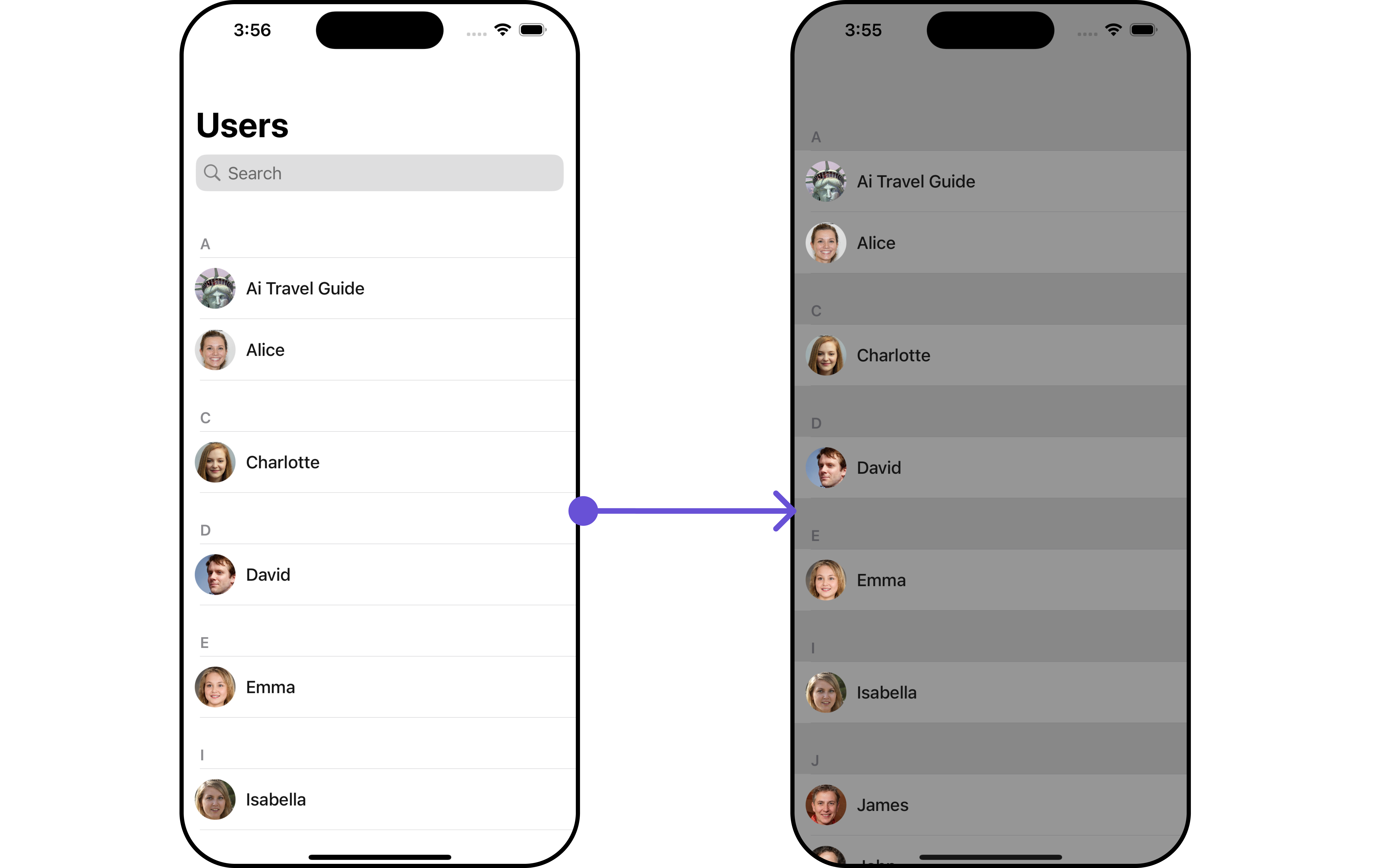
Let's say you want to change the style of the Users subcomponent and, in addition, you only want to display users with offline status.
You can modify the style using the `UsersStyle` method and filter the list with the `UsersRequestBuilder` method.
 ```swift theme={null}
let usersStyle = UsersStyle()
.set(background: .lightGray.withAlphaComponent(0.8))
let listItemStyle = ListItemStyle()
.set(background: .lightGray.withAlphaComponent(0.4))
let usersRequestBuilder = UsersRequest.UsersRequestBuilder(limit: 5).set(status: .offline)
let cometChatUsersWithMessages = CometChatUsersWithMessages(usersRequestBuilder: usersRequestBuilder)
.set(listItemStyle: listItemStyle)
cometChatUsersWithMessages.set(usersStyle: usersStyle)
let naviVC = UINavigationController(rootViewController: cometChatUsersWithMessages)
self.present(naviVC, animated: true)
```
make sure to `import CometChatSDK`
***
#### Messages
You can customize the properties of the Messages component by making use of the `messagesConfiguration`. You can accomplish this by employing the `messagesConfiguration` as demonstrated below:
```swift theme={null}
let messagesConfiguration = MessagesConfiguration()
```
All exposed properties of `MessagesConfiguration` can be found under [Messages](/ui-kit/ios/v4/messages). Properties marked with the 🛑 symbol are not accessible within the Configuration Object.
**Example**
Let's say you want to change the style of the Messages subcomponent and, in addition, you want to hide message composer.
You can modify the style using the `messagesStyle` method and hide using `hide(messageComposer: bool)` method.
```swift theme={null}
let usersStyle = UsersStyle()
.set(background: .lightGray.withAlphaComponent(0.8))
let listItemStyle = ListItemStyle()
.set(background: .lightGray.withAlphaComponent(0.4))
let usersRequestBuilder = UsersRequest.UsersRequestBuilder(limit: 5).set(status: .offline)
let cometChatUsersWithMessages = CometChatUsersWithMessages(usersRequestBuilder: usersRequestBuilder)
.set(listItemStyle: listItemStyle)
cometChatUsersWithMessages.set(usersStyle: usersStyle)
let naviVC = UINavigationController(rootViewController: cometChatUsersWithMessages)
self.present(naviVC, animated: true)
```
make sure to `import CometChatSDK`
***
#### Messages
You can customize the properties of the Messages component by making use of the `messagesConfiguration`. You can accomplish this by employing the `messagesConfiguration` as demonstrated below:
```swift theme={null}
let messagesConfiguration = MessagesConfiguration()
```
All exposed properties of `MessagesConfiguration` can be found under [Messages](/ui-kit/ios/v4/messages). Properties marked with the 🛑 symbol are not accessible within the Configuration Object.
**Example**
Let's say you want to change the style of the Messages subcomponent and, in addition, you want to hide message composer.
You can modify the style using the `messagesStyle` method and hide using `hide(messageComposer: bool)` method.
 ```swift theme={null}
let cometChatCornerStyle = CometChatCornerStyle.init(cornerRadius: 15)
let messagesStyle = MessagesStyle()
.set(cornerRadius: cometChatCornerStyle)
.set(borderColor: .systemPurple)
.set(borderWidth: 2)
let messagesConfiguration = MessagesConfiguration()
.set(messagesStyle: messagesStyle)
.hide(messageComposer: true)
let cometChatUsersWithMessages = CometChatUsersWithMessages()
.hide(search: true)
.set(messagesConfiguration: messagesConfiguration)
```
```swift theme={null}
let cometChatCornerStyle = CometChatCornerStyle.init(cornerRadius: 15)
let messagesStyle = MessagesStyle()
.set(cornerRadius: cometChatCornerStyle)
.set(borderColor: .systemPurple)
.set(borderWidth: 2)
let messagesConfiguration = MessagesConfiguration()
.set(messagesStyle: messagesStyle)
.hide(messageComposer: true)
let cometChatUsersWithMessages = CometChatUsersWithMessages()
.hide(search: true)
.set(messagesConfiguration: messagesConfiguration)
```