> ## Documentation Index
> Fetch the complete documentation index at: https://cometchat-22654f5b-docs-platform-docs-release.mintlify.site/llms.txt
> Use this file to discover all available pages before exploring further.
# User Details
> User Details — CometChat documentation.
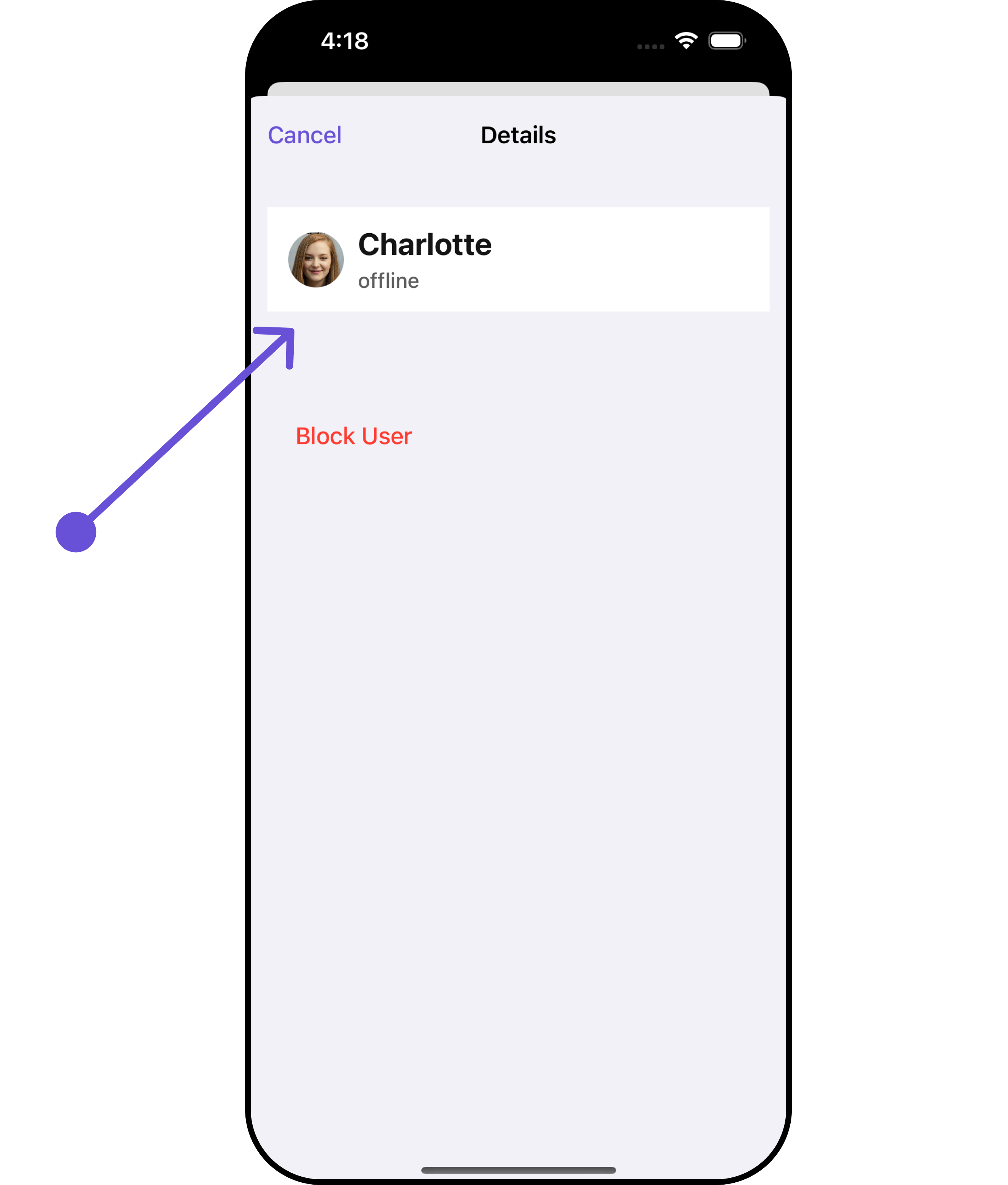
## Overview
`CometChatDetails` functions as a standalone component designed to establish a screen displaying the details of a specific user or group object. It inherits all properties and methods from the `CometChatListBase` class, ensuring comprehensive functionality and customization options.
CometChatDetails internally implements the following functionalities:
* User Information: It displays details about the user. This includes his/her profile picture, name, status, and other relevant information.
* User Actions: The details screen provides actions to block/unblock the user.
 ## Usage
### Integration
As `CometChatDetails` functions as a **view controller**, it can be directly launched through a button click or any user-initiated action. Additionally, it can be seamlessly integrated into a tab view controller. `CometChatDetails` offers a range of parameters and methods for customizing its user interface.
```swift Swift theme={null}
let user = User(uid: "Your UID", name: "name")
let cometChatDetails = CometChatDetails()
cometChatDetails.set(user: user)
let naviVC = UINavigationController(rootViewController: cometChatDetails)
self.present(naviVC, animated: true)
```
If you are already using a navigation controller, you can use the pushViewController function instead of presenting the view controller.
### Actions
[Actions](/ui-kit/ios/v4/components-overview#actions) dictate how a component functions. They are divided into two types: Predefined and User-defined. You can override either type, allowing you to tailor the behavior of the component to fit your specific needs.
##### 1. SetOnClose
The `setOnClose` event is typically triggered when the close button is clicked and it carries a default action. However, with the following code snippet, you can effortlessly override this default operation.
This action does not come with any predefined behavior. However, you have the flexibility to override this event and tailor it to suit your needs using the following code snippet.
```swift theme={null}
let cometChatDetails = CometChatDetails()
.set (onClose:{
//Perform Your Action
})
```
##### 2. SetOnBack
This method allows users to override the onBack Pressed behavior in **CometChatDetails** by utilizing the `setOnBack` , providing customization options for handling the back action.
By default, this action has a predefined behavior: it simply dismisses the current view controller. However, the flexibility of CometChat UI Kit allows you to override this standard behavior according to your application's specific requirements. You can define a custom action that will be performed instead when the back button is pressed.
```swift theme={null}
let cometChatDetails = CometChatDetails()
.setOnBack {
//Perform Your Action
}
```
##### 3. SetOnError
This method `setOnError`, allows users to override error handling within **CometChatDetails**, providing greater control over error responses and actions.
```swift theme={null}
let cometChatDetails = CometChatDetails()
.setOnError { error in
//Perform Your Action
}
```
### Filters
**Filters** allow you to customize the data displayed in a list within a Component. You can filter the list based on your specific criteria, allowing for a more customized. Filters can be applied using RequestBuilders of Chat SDK.
`CometChatDetails` component does not have available filters.
***
### Events
[Events](/ui-kit/ios/v4/components-overview#events) are emitted by a `Component`. By using event you can extend existing functionality. Being global events, they can be applied in Multiple Locations and are capable of being Added or Removed.
To handle events supported by Users you have to add corresponding listeners by using `CometChatUserEvents`
| Events | Description |
| ----------------- | --------------------------------------------------------------------- |
| emitOnUserBlock | This will get triggered when the logged in user blocks another user |
| emitOnUserUnblock | This will get triggered when the logged in user unblocks another user |
```swift theme={null}
///pass the [User] object of the user which has been blocked by the logged in user
CometChatUserEvents.emitOnUserBlock(user: User)
///pass the [User] object of the user which has been unblocked by the logged in user
CometChatUserEvents.emitOnUserUnblock(user: User)
```
**Usage**
```swift Swift theme={null}
// View controller from your project where you want to listen events.
public class ViewController: UIViewController {
public override func viewDidLoad() {
super.viewDidLoad()
// Subscribing for the listener to listen events from user module
CometChatUserEvents.addListener("UNIQUE_ID", self as CometChatUserEventListener)
}
public override func viewWillDisappear(_ animated: Bool) {
// Uncubscribing for the listener to listen events from user module
CometChatUserEvents.removeListener("LISTENER_ID_USED_FOR_ADDING_THIS_LISTENER")
}
}
// Listener events from user module
extension ViewController: CometChatUserEventListener {
func onUserBlock(user: User) {
// Do Stuff
}
func onUserUnblock(user: User) {
// Do Stuff
}
}
```
***
## Customization
To fit your app's design requirements, you can customize the appearance of the details component. We provide exposed methods that allow you to modify the experience and behavior according to your specific needs.
### Style
Using Style you can customize the look and feel of the component in your app, These parameters typically control elements such as the color, size, shape, and fonts used within the component.
##### 1. Details Style
You can set the `Details Style` to the User Detail Component to customize the styling.
```swift theme={null}
// Creating DetailsStyle object
let detailsStyle = DetailsStyle()
// Creating Modifying the propeties of details
detailsStyle.set(background: .black)
.set(cornerRadius: CometChatCornerStyle(cornerRadius: 0.0))
.set(borderColor: .blue)
.set(borderWidth: 0)
.set(titleFont: .systemFont(ofSize: 18))
.set(titleColor: .white)
.set(onlineStatusColor: .green)
.set(listItemTitleFont: .systemFont(ofSize: 18))
.set(listItemTitleColor: .red)
.set(listItemsubTitleFont: .systemFont(ofSize: 18))
let cometChatDetails = CometChatDetails()
.set(user: user)
// Setting the detailsStyle
cometChatDetails.set(detailsStyle: detailsStyle)
let naviVC = UINavigationController(rootViewController: cometChatDetails)
self.present(naviVC, animated: true)
```
## Usage
### Integration
As `CometChatDetails` functions as a **view controller**, it can be directly launched through a button click or any user-initiated action. Additionally, it can be seamlessly integrated into a tab view controller. `CometChatDetails` offers a range of parameters and methods for customizing its user interface.
```swift Swift theme={null}
let user = User(uid: "Your UID", name: "name")
let cometChatDetails = CometChatDetails()
cometChatDetails.set(user: user)
let naviVC = UINavigationController(rootViewController: cometChatDetails)
self.present(naviVC, animated: true)
```
If you are already using a navigation controller, you can use the pushViewController function instead of presenting the view controller.
### Actions
[Actions](/ui-kit/ios/v4/components-overview#actions) dictate how a component functions. They are divided into two types: Predefined and User-defined. You can override either type, allowing you to tailor the behavior of the component to fit your specific needs.
##### 1. SetOnClose
The `setOnClose` event is typically triggered when the close button is clicked and it carries a default action. However, with the following code snippet, you can effortlessly override this default operation.
This action does not come with any predefined behavior. However, you have the flexibility to override this event and tailor it to suit your needs using the following code snippet.
```swift theme={null}
let cometChatDetails = CometChatDetails()
.set (onClose:{
//Perform Your Action
})
```
##### 2. SetOnBack
This method allows users to override the onBack Pressed behavior in **CometChatDetails** by utilizing the `setOnBack` , providing customization options for handling the back action.
By default, this action has a predefined behavior: it simply dismisses the current view controller. However, the flexibility of CometChat UI Kit allows you to override this standard behavior according to your application's specific requirements. You can define a custom action that will be performed instead when the back button is pressed.
```swift theme={null}
let cometChatDetails = CometChatDetails()
.setOnBack {
//Perform Your Action
}
```
##### 3. SetOnError
This method `setOnError`, allows users to override error handling within **CometChatDetails**, providing greater control over error responses and actions.
```swift theme={null}
let cometChatDetails = CometChatDetails()
.setOnError { error in
//Perform Your Action
}
```
### Filters
**Filters** allow you to customize the data displayed in a list within a Component. You can filter the list based on your specific criteria, allowing for a more customized. Filters can be applied using RequestBuilders of Chat SDK.
`CometChatDetails` component does not have available filters.
***
### Events
[Events](/ui-kit/ios/v4/components-overview#events) are emitted by a `Component`. By using event you can extend existing functionality. Being global events, they can be applied in Multiple Locations and are capable of being Added or Removed.
To handle events supported by Users you have to add corresponding listeners by using `CometChatUserEvents`
| Events | Description |
| ----------------- | --------------------------------------------------------------------- |
| emitOnUserBlock | This will get triggered when the logged in user blocks another user |
| emitOnUserUnblock | This will get triggered when the logged in user unblocks another user |
```swift theme={null}
///pass the [User] object of the user which has been blocked by the logged in user
CometChatUserEvents.emitOnUserBlock(user: User)
///pass the [User] object of the user which has been unblocked by the logged in user
CometChatUserEvents.emitOnUserUnblock(user: User)
```
**Usage**
```swift Swift theme={null}
// View controller from your project where you want to listen events.
public class ViewController: UIViewController {
public override func viewDidLoad() {
super.viewDidLoad()
// Subscribing for the listener to listen events from user module
CometChatUserEvents.addListener("UNIQUE_ID", self as CometChatUserEventListener)
}
public override func viewWillDisappear(_ animated: Bool) {
// Uncubscribing for the listener to listen events from user module
CometChatUserEvents.removeListener("LISTENER_ID_USED_FOR_ADDING_THIS_LISTENER")
}
}
// Listener events from user module
extension ViewController: CometChatUserEventListener {
func onUserBlock(user: User) {
// Do Stuff
}
func onUserUnblock(user: User) {
// Do Stuff
}
}
```
***
## Customization
To fit your app's design requirements, you can customize the appearance of the details component. We provide exposed methods that allow you to modify the experience and behavior according to your specific needs.
### Style
Using Style you can customize the look and feel of the component in your app, These parameters typically control elements such as the color, size, shape, and fonts used within the component.
##### 1. Details Style
You can set the `Details Style` to the User Detail Component to customize the styling.
```swift theme={null}
// Creating DetailsStyle object
let detailsStyle = DetailsStyle()
// Creating Modifying the propeties of details
detailsStyle.set(background: .black)
.set(cornerRadius: CometChatCornerStyle(cornerRadius: 0.0))
.set(borderColor: .blue)
.set(borderWidth: 0)
.set(titleFont: .systemFont(ofSize: 18))
.set(titleColor: .white)
.set(onlineStatusColor: .green)
.set(listItemTitleFont: .systemFont(ofSize: 18))
.set(listItemTitleColor: .red)
.set(listItemsubTitleFont: .systemFont(ofSize: 18))
let cometChatDetails = CometChatDetails()
.set(user: user)
// Setting the detailsStyle
cometChatDetails.set(detailsStyle: detailsStyle)
let naviVC = UINavigationController(rootViewController: cometChatDetails)
self.present(naviVC, animated: true)
```
 List of properties exposed by DetailsStyle
| Property | Description | Method |
| --------------------------------- | ----------------------------------------------- | -------------------------------------------------- |
| Background | Sets the background color for details | `.set(background: UIColor)` |
| CornerRadius | Sets the corner radius for details | `.set(cornerRadius: CometChatCornerStyle)` |
| BorderWidth | Sets the border width for details | `.set(borderWidth: CGFloat)` |
| TitleColor | Sets the title color for details | `.set(titleColor: UIColor)` |
| TitleFont | Sets the title font for details | `.set(titleFont: UIFont)` |
| BackButtonTint | Sets the back button tint color for details | `.set(backButtonTint: UIColor)` |
| OnlineStatusColor | Sets online status color for details | `.set(onlineStatusColor: UIColor)` |
| PrivateGroupIconBackgroundColor | Sets private group background color for details | `.set(privateGroupIconBackgroundColor: UIColor)` |
| ProtectedGroupIconBackgroundColor | Sets add button font for details | `.set(protectedGroupIconBackgroundColor: UIColor)` |
| HeaderBackground | Sets header background color for details | `.set(headerBackground: UIColor)` |
| HeaderTextColor | Sets header text color for details | `.set(headerTextColor: UIColor)` |
| HeaderTextFont | Sets header text font for details | `.set(headerTextFont: UIFont)` |
| ListItemTitleColor | Sets list item title color for details | `.set(listItemTitleColor: UIColor)` |
| ListItemTitleFont | Sets list item title font for details | `.set(listItemTitleFont: UIFont)` |
| ListItemSubtitleFont | Sets list item subtitle font for details | `.set(listItemsubTitleFont: UIFont)` |
| ListItemSubtitleColor | Sets list item subtitle color for details | `.set(listItemSubtitleColor: UIColor)` |
##### 2. Avatar Style
To apply customized styles to the `Avatar` component in the User Details Component, you can use the following code snippet. For further insights on `Avatar` Styles [refer](/ui-kit/ios/v4/avatar)
```swift theme={null}
let avatarStyle = AvatarStyle()
// Creating Modifying the propeties of avatar
avatarStyle.set(background: .red)
.set(textFont: .systemFont(ofSize: 18))
.set(textColor: .white)
.set(cornerRadius: CometChatCornerStyle(cornerRadius: 8.0))
.set(borderColor: .white)
.set(borderWidth: 5)
.set(outerViewWidth: 3)
.set(outerViewSpacing: 3)
let cometChatDetails = CometChatDetails()
.set(avatarStyle: avatarStyle)
.set(user: user)
let naviVC = UINavigationController(rootViewController: cometChatDetails)
self.present(naviVC, animated: true)
```
##### 3. StatusIndicator Style
To apply customized styles to the Status Indicator component in the User Details Component, You can use the following code snippet. For further insights on Status Indicator Styles [refer](/ui-kit/ios/v4/status-indicator)
```swift theme={null}
// Creating StatusIndicatorStyle object
let statusIndicatorStyle = StatusIndicatorStyle()
// Creating Modifying the propeties of avatar
statusIndicatorStyle.set(background: .red)
.set(cornerRadius: CometChatCornerStyle(cornerRadius: 8.0))
.set(borderColor: .white)
.set(borderWidth: 5)
let cometChatDetails = CometChatDetails()
.set(statusIndicatorStyle: statusIndicatorStyle)
.set(user: user)
let naviVC = UINavigationController(rootViewController: cometChatDetails)
self.present(naviVC, animated: true)
```
***
##### 4. ListItem Style
To apply customized styles to the List Item component in the User Details Component, You can use the following code snippet. For further insights on List Item Styles [refer](/ui-kit/ios/v4/list-item)
```swift theme={null}
// Creating ListItemStyle object
let listItemStyle = ListItemStyle()
// Creating Modifying the propeties of list item
listItemStyle.set(background: .black)
.set(titleFont: .systemFont(ofSize: 18))
.set(titleColor: .white)
.set(cornerRadius: CometChatCornerStyle(cornerRadius: 2.0))
.set(borderColor: .white)
.set(borderWidth: 5)
let cometChatDetails = CometChatDetails()
.set(listItemStyle: listItemStyle)
.set(user: user)
let naviVC = UINavigationController(rootViewController: cometChatDetails)
self.present(naviVC, animated: true)
```
***
### Functionality
These are a set of small functional customizations that allow you to fine-tune the overall experience of the component. With these, you can change text, set custom icons, and toggle the visibility of UI elements.
```swift theme={null}
let cometChatDetails = CometChatDetails()
.hide(profile: true)
.set(closeButtonIcon: UIImage(systemName: "paperplane.fill")!)
.set(title: "cometchat", mode: .automatic)
.set(user: user)
```
Below is a list of customizations along with corresponding code snippets
| Property | Description | Code |
| ------------------------ | -------------------------------------------------------------------- | ---------------------------------------------------------------------------------- |
| **Set Title** | Used to set the title | `.set(title: String, mode: UINavigationItem.LargeTitleDisplayMode)` |
| **Hide Profile** | Used to hide user profile view | `.hide(profile: Bool)` |
| **Set Close Button** | Used to set close button | `.set(closeButtonIcon: UIImage)` |
| **Disable UserPresence** | Used to control visibility of user indicator shown if user is online | `.disable(userPreference: Bool)` |
| **Data** | Used to pass custom details template | `setData(data: ((_ user: User?, _ group: Group?) -> [CometChatDetailsTemplate])?)` |
| **Set User** | Used to set the user | `.set(user: User?)` |
***
### Advance
For advanced-level customization, you can set custom views to the component. This lets you tailor each aspect of the component to fit your exact needs and application aesthetics. You can create and define your views, layouts, and UI elements and then incorporate those into the component.
***
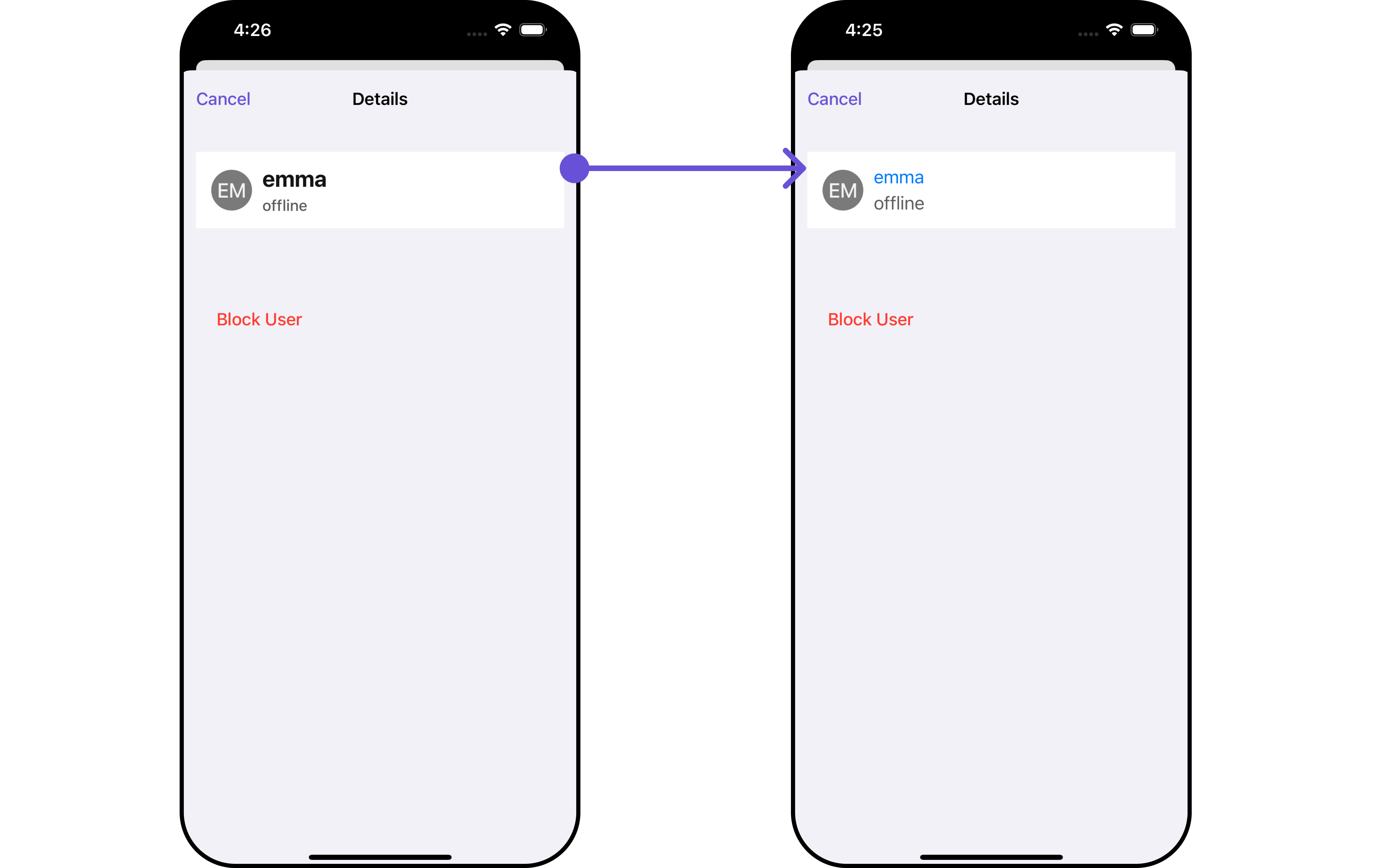
#### SetSubTitleView
Tailor the subtitle view for each user item to suit your specific preferences and needs.
```swift theme={null}
let cometChatDetails = CometChatDetails()
.set(subTitleView: { user, group in
//Perform Your Actions
})
```
**Example**
List of properties exposed by DetailsStyle
| Property | Description | Method |
| --------------------------------- | ----------------------------------------------- | -------------------------------------------------- |
| Background | Sets the background color for details | `.set(background: UIColor)` |
| CornerRadius | Sets the corner radius for details | `.set(cornerRadius: CometChatCornerStyle)` |
| BorderWidth | Sets the border width for details | `.set(borderWidth: CGFloat)` |
| TitleColor | Sets the title color for details | `.set(titleColor: UIColor)` |
| TitleFont | Sets the title font for details | `.set(titleFont: UIFont)` |
| BackButtonTint | Sets the back button tint color for details | `.set(backButtonTint: UIColor)` |
| OnlineStatusColor | Sets online status color for details | `.set(onlineStatusColor: UIColor)` |
| PrivateGroupIconBackgroundColor | Sets private group background color for details | `.set(privateGroupIconBackgroundColor: UIColor)` |
| ProtectedGroupIconBackgroundColor | Sets add button font for details | `.set(protectedGroupIconBackgroundColor: UIColor)` |
| HeaderBackground | Sets header background color for details | `.set(headerBackground: UIColor)` |
| HeaderTextColor | Sets header text color for details | `.set(headerTextColor: UIColor)` |
| HeaderTextFont | Sets header text font for details | `.set(headerTextFont: UIFont)` |
| ListItemTitleColor | Sets list item title color for details | `.set(listItemTitleColor: UIColor)` |
| ListItemTitleFont | Sets list item title font for details | `.set(listItemTitleFont: UIFont)` |
| ListItemSubtitleFont | Sets list item subtitle font for details | `.set(listItemsubTitleFont: UIFont)` |
| ListItemSubtitleColor | Sets list item subtitle color for details | `.set(listItemSubtitleColor: UIColor)` |
##### 2. Avatar Style
To apply customized styles to the `Avatar` component in the User Details Component, you can use the following code snippet. For further insights on `Avatar` Styles [refer](/ui-kit/ios/v4/avatar)
```swift theme={null}
let avatarStyle = AvatarStyle()
// Creating Modifying the propeties of avatar
avatarStyle.set(background: .red)
.set(textFont: .systemFont(ofSize: 18))
.set(textColor: .white)
.set(cornerRadius: CometChatCornerStyle(cornerRadius: 8.0))
.set(borderColor: .white)
.set(borderWidth: 5)
.set(outerViewWidth: 3)
.set(outerViewSpacing: 3)
let cometChatDetails = CometChatDetails()
.set(avatarStyle: avatarStyle)
.set(user: user)
let naviVC = UINavigationController(rootViewController: cometChatDetails)
self.present(naviVC, animated: true)
```
##### 3. StatusIndicator Style
To apply customized styles to the Status Indicator component in the User Details Component, You can use the following code snippet. For further insights on Status Indicator Styles [refer](/ui-kit/ios/v4/status-indicator)
```swift theme={null}
// Creating StatusIndicatorStyle object
let statusIndicatorStyle = StatusIndicatorStyle()
// Creating Modifying the propeties of avatar
statusIndicatorStyle.set(background: .red)
.set(cornerRadius: CometChatCornerStyle(cornerRadius: 8.0))
.set(borderColor: .white)
.set(borderWidth: 5)
let cometChatDetails = CometChatDetails()
.set(statusIndicatorStyle: statusIndicatorStyle)
.set(user: user)
let naviVC = UINavigationController(rootViewController: cometChatDetails)
self.present(naviVC, animated: true)
```
***
##### 4. ListItem Style
To apply customized styles to the List Item component in the User Details Component, You can use the following code snippet. For further insights on List Item Styles [refer](/ui-kit/ios/v4/list-item)
```swift theme={null}
// Creating ListItemStyle object
let listItemStyle = ListItemStyle()
// Creating Modifying the propeties of list item
listItemStyle.set(background: .black)
.set(titleFont: .systemFont(ofSize: 18))
.set(titleColor: .white)
.set(cornerRadius: CometChatCornerStyle(cornerRadius: 2.0))
.set(borderColor: .white)
.set(borderWidth: 5)
let cometChatDetails = CometChatDetails()
.set(listItemStyle: listItemStyle)
.set(user: user)
let naviVC = UINavigationController(rootViewController: cometChatDetails)
self.present(naviVC, animated: true)
```
***
### Functionality
These are a set of small functional customizations that allow you to fine-tune the overall experience of the component. With these, you can change text, set custom icons, and toggle the visibility of UI elements.
```swift theme={null}
let cometChatDetails = CometChatDetails()
.hide(profile: true)
.set(closeButtonIcon: UIImage(systemName: "paperplane.fill")!)
.set(title: "cometchat", mode: .automatic)
.set(user: user)
```
Below is a list of customizations along with corresponding code snippets
| Property | Description | Code |
| ------------------------ | -------------------------------------------------------------------- | ---------------------------------------------------------------------------------- |
| **Set Title** | Used to set the title | `.set(title: String, mode: UINavigationItem.LargeTitleDisplayMode)` |
| **Hide Profile** | Used to hide user profile view | `.hide(profile: Bool)` |
| **Set Close Button** | Used to set close button | `.set(closeButtonIcon: UIImage)` |
| **Disable UserPresence** | Used to control visibility of user indicator shown if user is online | `.disable(userPreference: Bool)` |
| **Data** | Used to pass custom details template | `setData(data: ((_ user: User?, _ group: Group?) -> [CometChatDetailsTemplate])?)` |
| **Set User** | Used to set the user | `.set(user: User?)` |
***
### Advance
For advanced-level customization, you can set custom views to the component. This lets you tailor each aspect of the component to fit your exact needs and application aesthetics. You can create and define your views, layouts, and UI elements and then incorporate those into the component.
***
#### SetSubTitleView
Tailor the subtitle view for each user item to suit your specific preferences and needs.
```swift theme={null}
let cometChatDetails = CometChatDetails()
.set(subTitleView: { user, group in
//Perform Your Actions
})
```
**Example**
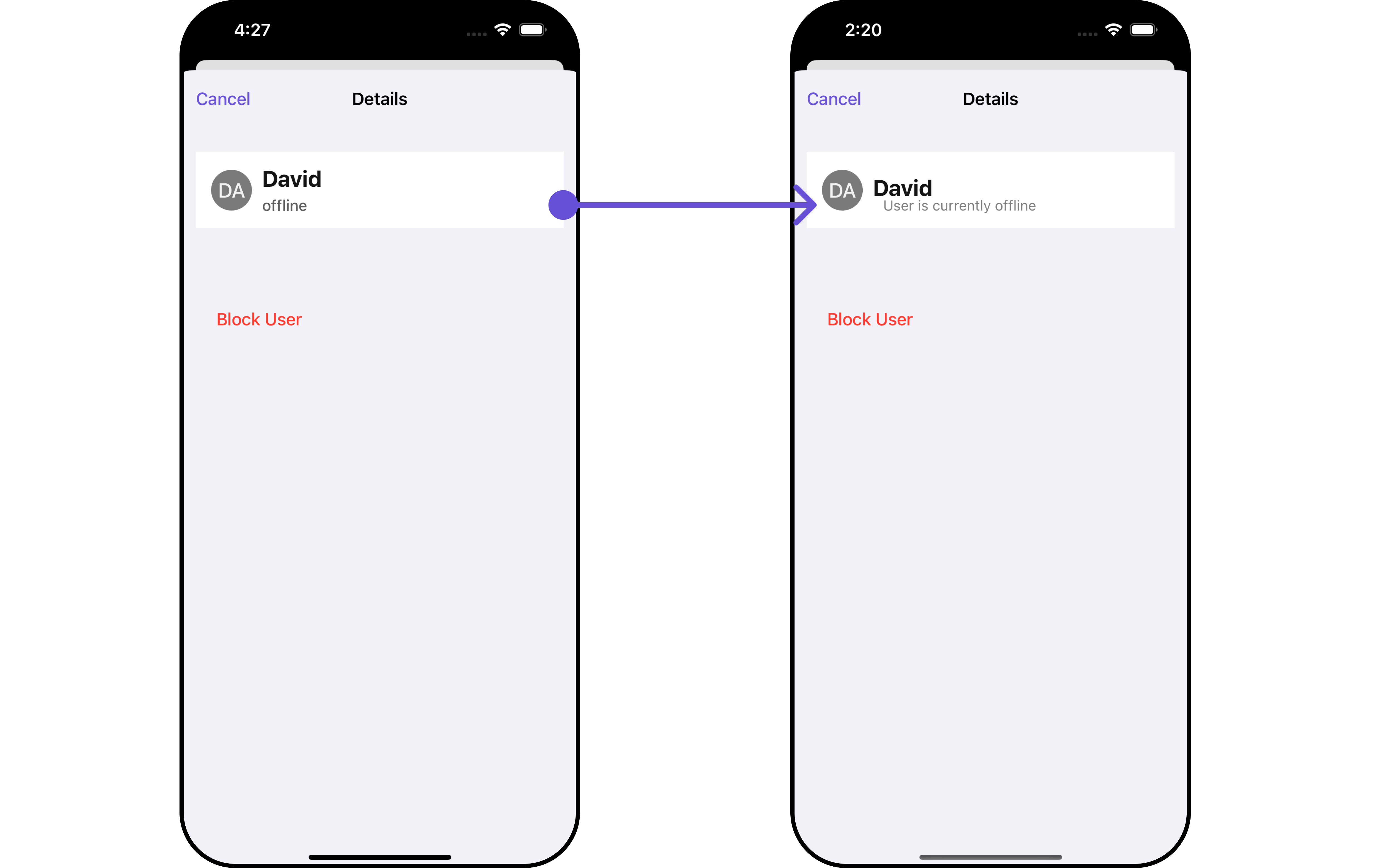 You can indeed create a custom Subtitle UIView file named `CustomUserDetailsSubtitleView`.
Afterwards, seamlessly integrate this `CustomUserDetailsSubtitleView` UIView file into the `.setSubtileView` method within **CometChatDetails()**.
```swift CustomUserDetailsSubtitleView theme={null}
import UIKit
import CometChatSDK
class CustomUserDetailsSubtitleView: UIView {
private let subtitleLabel: UILabel = {
let label = UILabel()
label.font = UIFont.systemFont(ofSize: 14)
label.textColor = .gray
label.translatesAutoresizingMaskIntoConstraints = false
return label
}()
var user: CometChatSDK.User! {
didSet {
switch user.status {
case .online:
subtitleLabel.text = "User is currently online"
case .offline:
subtitleLabel.text = "User is currently offline"
default:
subtitleLabel.text = "User status is unknown"
}
}
}
override init(frame: CGRect) {
super.init(frame: frame)
addSubview(subtitleLabel) // add it as a subview
NSLayoutConstraint.activate([
subtitleLabel.leadingAnchor.constraint(equalTo: leadingAnchor, constant: 10),
subtitleLabel.trailingAnchor.constraint(equalTo: trailingAnchor, constant: -10),
subtitleLabel.centerYAnchor.constraint(equalTo: centerYAnchor)
])
}
required init?(coder: NSCoder) {
fatalError("init(coder:) has not been implemented")
}
}
```
```swift View controller theme={null}
let cometChatDetails = CometChatDetails()
.set(user: user)
.set(subTitleView: { user, group in
let customUserDetailsSubtitleView = CustomUserDetailsSubtitleView()
customUserDetailsSubtitleView.user = user
return customUserDetailsSubtitleView
})
let naviVC = UINavigationController(rootViewController: cometChatDetails)
self.present(naviVC, animated: true)
```
***
#### SetCustomProfileView report
Tailor the custom profile view for each user item to suit your specific preferences and needs.
```swift theme={null}
let cometChatDetails = CometChatDetails()
.set(customProfileView: UIView)
```
**Example**
You can indeed create a custom profile view UIView file named `CustomUDProfileView`.
Afterwards, seamlessly integrate this `CustomUDProfileView` UIView file into the `.setCustomProfileview` method within **CometChatUsers()**.
```swift CustomUDProfileView theme={null}
import UIKit
import CometChatSDK
import CometChatUIKitSwift
class CustomUDProfileView: UIView {
private let imageView: CometChatAvatar = {
let imgView = CometChatAvatar(frame: .zero)
imgView.translatesAutoresizingMaskIntoConstraints = false
return imgView
}()
private let nameLabel: UILabel = {
let label = UILabel()
label.translatesAutoresizingMaskIntoConstraints = false
label.textColor = .white
label.font = UIFont.boldSystemFont(ofSize: 14)
return label
}()
private let statusLabel: UILabel = {
let label = UILabel()
label.translatesAutoresizingMaskIntoConstraints = false
label.textColor = .white
label.font = UIFont.systemFont(ofSize: 10)
return label
}()
var user: CometChatSDK.User! {
didSet {
nameLabel.text = user.name
imageView.setAvatar(avatarUrl: user.avatar ?? "", with: user.name ?? "")
// CometChatSDK doesn't provide an API for User's status
// statusLabel.text = statusString(from: user.status)
}
}
override init(frame: CGRect) {
super.init(frame: frame)
addSubview(imageView)
addSubview(nameLabel)
NSLayoutConstraint.activate([
imageView.centerYAnchor.constraint(equalTo: centerYAnchor),
imageView.leadingAnchor.constraint(equalTo: leadingAnchor, constant: 10),
imageView.widthAnchor.constraint(equalToConstant: 40),
imageView.heightAnchor.constraint(equalToConstant: 40),
nameLabel.leadingAnchor.constraint(equalTo: imageView.trailingAnchor, constant: 10),
nameLabel.topAnchor.constraint(equalTo: imageView.topAnchor),
nameLabel.centerYAnchor.constraint(equalTo: centerYAnchor)
])
backgroundColor = UIColor(named: "#6e2bd9")
layer.cornerRadius = 20
layer.borderWidth = 2
layer.borderColor = UIColor(named: "#e9baff")?.cgColor
}
required init?(coder: NSCoder) {
fatalError("init(coder:) has not been implemented")
}
}
```
```javascript theme={null}
let customUDProfileView = CustomUDProfileView()
let cometChatDetails = CometChatDetails()
.set(user: user)
.set(customProfileView: customUDProfileView)
```
***
#### DetailsTemplate report
The `CometChatDetailsTemplate` offers a structure for organizing information in the CometChat details component. It serves as a blueprint, defining how user-related details are presented. This structure allows for customization and organization within the CometChat interface.
```swift theme={null}
let cometChatDetails = CometChatDetails()
.set(templates: [CometChatDetailsTemplate]?)
```
**Example**
You can create a new array of \[detailsTemplate] objects. This array will be inflated and then passed to the .setTemplate.
```swift Swift theme={null}
let blockUserOption = CometChatDetailsOption(
id: "custom-block",
title: "BLOCK USER",
customView: nil,
titleColor: .purple,
titleFont: UIFont(name: "Inter", size: 16) ?? UIFont.systemFont(ofSize: 16),
height: nil,
onClick: { option, user, group, section, controller in
print("Block user option clicked")
})
let reportUserOption = CometChatDetailsOption(
id: "custom-report",
title: "REPORT USER",
customView: nil,
titleColor: .purple,
titleFont: UIFont(name: "Inter", size: 16) ?? UIFont.systemFont(ofSize: 16),
height: nil,
onClick: { option, user, group, section, controller in
print("Report user option clicked")
})
let detailsTemplate = CometChatDetailsTemplate(
id: "Block",
title: "BLOCK/REPORT",
titleFont: UIFont.systemFont(ofSize: 20),
titleColor: .purple,
itemSeparatorColor: .gray,
hideItemSeparator: false,
customView: nil,
options: { user, group in
return [blockUserOption, reportUserOption]
})
```
You have the flexibility to provide your own templates to CometChatDetails as needed.
```swift theme={null}
let cometChatDetails = CometChatDetails()
cometChatDetails.set(user: user)
cometChatDetails.set(templates: [detailsTemplate])
```
***
#### DetailsOption
The `DetailsOption` defines the structure for individual options within the CometChat details component, facilitating customization and functionality for user interactions.
This defines the structure of each option for a template in the details component.
| Properties | Type | Description |
| ---------------------- | ------------------------------------------------------------------------------------------------------------------------------ | ------------------------------------------------------------ |
| **Id** | `String` | Unique identifier for the template |
| **Title** | `String` | Text to display below the template |
| **TitleColor** | `UIColor` | Defines the color for the title in the template |
| **ItemSeparatorColor** | `UIFont` | Defines the separator color for the option in the template |
| **HideItemSeparator** | `Bool` | Used to hide the item seperator in the template |
| **CustomView** | `UIView` | Used to set the customView for the template |
| **Options** | `((_ user: User?, _ group: Group?) -> [CometChatDetailsOption])?` | Used to set the list of options for the template |
| **Title Font** | `UIFont` | Sets all the different properties of font for the title text |
| **Height** | `CGFloat` | Sets the height |
| **On click** | `((_ user: User?, _ group: Group?, _ section: Int, _ option: CometChatDetailsOption, _ controller: UIViewController?) -> ())?` | Sets the onClick Handler for the option |
You can indeed create a custom Subtitle UIView file named `CustomUserDetailsSubtitleView`.
Afterwards, seamlessly integrate this `CustomUserDetailsSubtitleView` UIView file into the `.setSubtileView` method within **CometChatDetails()**.
```swift CustomUserDetailsSubtitleView theme={null}
import UIKit
import CometChatSDK
class CustomUserDetailsSubtitleView: UIView {
private let subtitleLabel: UILabel = {
let label = UILabel()
label.font = UIFont.systemFont(ofSize: 14)
label.textColor = .gray
label.translatesAutoresizingMaskIntoConstraints = false
return label
}()
var user: CometChatSDK.User! {
didSet {
switch user.status {
case .online:
subtitleLabel.text = "User is currently online"
case .offline:
subtitleLabel.text = "User is currently offline"
default:
subtitleLabel.text = "User status is unknown"
}
}
}
override init(frame: CGRect) {
super.init(frame: frame)
addSubview(subtitleLabel) // add it as a subview
NSLayoutConstraint.activate([
subtitleLabel.leadingAnchor.constraint(equalTo: leadingAnchor, constant: 10),
subtitleLabel.trailingAnchor.constraint(equalTo: trailingAnchor, constant: -10),
subtitleLabel.centerYAnchor.constraint(equalTo: centerYAnchor)
])
}
required init?(coder: NSCoder) {
fatalError("init(coder:) has not been implemented")
}
}
```
```swift View controller theme={null}
let cometChatDetails = CometChatDetails()
.set(user: user)
.set(subTitleView: { user, group in
let customUserDetailsSubtitleView = CustomUserDetailsSubtitleView()
customUserDetailsSubtitleView.user = user
return customUserDetailsSubtitleView
})
let naviVC = UINavigationController(rootViewController: cometChatDetails)
self.present(naviVC, animated: true)
```
***
#### SetCustomProfileView report
Tailor the custom profile view for each user item to suit your specific preferences and needs.
```swift theme={null}
let cometChatDetails = CometChatDetails()
.set(customProfileView: UIView)
```
**Example**
You can indeed create a custom profile view UIView file named `CustomUDProfileView`.
Afterwards, seamlessly integrate this `CustomUDProfileView` UIView file into the `.setCustomProfileview` method within **CometChatUsers()**.
```swift CustomUDProfileView theme={null}
import UIKit
import CometChatSDK
import CometChatUIKitSwift
class CustomUDProfileView: UIView {
private let imageView: CometChatAvatar = {
let imgView = CometChatAvatar(frame: .zero)
imgView.translatesAutoresizingMaskIntoConstraints = false
return imgView
}()
private let nameLabel: UILabel = {
let label = UILabel()
label.translatesAutoresizingMaskIntoConstraints = false
label.textColor = .white
label.font = UIFont.boldSystemFont(ofSize: 14)
return label
}()
private let statusLabel: UILabel = {
let label = UILabel()
label.translatesAutoresizingMaskIntoConstraints = false
label.textColor = .white
label.font = UIFont.systemFont(ofSize: 10)
return label
}()
var user: CometChatSDK.User! {
didSet {
nameLabel.text = user.name
imageView.setAvatar(avatarUrl: user.avatar ?? "", with: user.name ?? "")
// CometChatSDK doesn't provide an API for User's status
// statusLabel.text = statusString(from: user.status)
}
}
override init(frame: CGRect) {
super.init(frame: frame)
addSubview(imageView)
addSubview(nameLabel)
NSLayoutConstraint.activate([
imageView.centerYAnchor.constraint(equalTo: centerYAnchor),
imageView.leadingAnchor.constraint(equalTo: leadingAnchor, constant: 10),
imageView.widthAnchor.constraint(equalToConstant: 40),
imageView.heightAnchor.constraint(equalToConstant: 40),
nameLabel.leadingAnchor.constraint(equalTo: imageView.trailingAnchor, constant: 10),
nameLabel.topAnchor.constraint(equalTo: imageView.topAnchor),
nameLabel.centerYAnchor.constraint(equalTo: centerYAnchor)
])
backgroundColor = UIColor(named: "#6e2bd9")
layer.cornerRadius = 20
layer.borderWidth = 2
layer.borderColor = UIColor(named: "#e9baff")?.cgColor
}
required init?(coder: NSCoder) {
fatalError("init(coder:) has not been implemented")
}
}
```
```javascript theme={null}
let customUDProfileView = CustomUDProfileView()
let cometChatDetails = CometChatDetails()
.set(user: user)
.set(customProfileView: customUDProfileView)
```
***
#### DetailsTemplate report
The `CometChatDetailsTemplate` offers a structure for organizing information in the CometChat details component. It serves as a blueprint, defining how user-related details are presented. This structure allows for customization and organization within the CometChat interface.
```swift theme={null}
let cometChatDetails = CometChatDetails()
.set(templates: [CometChatDetailsTemplate]?)
```
**Example**
You can create a new array of \[detailsTemplate] objects. This array will be inflated and then passed to the .setTemplate.
```swift Swift theme={null}
let blockUserOption = CometChatDetailsOption(
id: "custom-block",
title: "BLOCK USER",
customView: nil,
titleColor: .purple,
titleFont: UIFont(name: "Inter", size: 16) ?? UIFont.systemFont(ofSize: 16),
height: nil,
onClick: { option, user, group, section, controller in
print("Block user option clicked")
})
let reportUserOption = CometChatDetailsOption(
id: "custom-report",
title: "REPORT USER",
customView: nil,
titleColor: .purple,
titleFont: UIFont(name: "Inter", size: 16) ?? UIFont.systemFont(ofSize: 16),
height: nil,
onClick: { option, user, group, section, controller in
print("Report user option clicked")
})
let detailsTemplate = CometChatDetailsTemplate(
id: "Block",
title: "BLOCK/REPORT",
titleFont: UIFont.systemFont(ofSize: 20),
titleColor: .purple,
itemSeparatorColor: .gray,
hideItemSeparator: false,
customView: nil,
options: { user, group in
return [blockUserOption, reportUserOption]
})
```
You have the flexibility to provide your own templates to CometChatDetails as needed.
```swift theme={null}
let cometChatDetails = CometChatDetails()
cometChatDetails.set(user: user)
cometChatDetails.set(templates: [detailsTemplate])
```
***
#### DetailsOption
The `DetailsOption` defines the structure for individual options within the CometChat details component, facilitating customization and functionality for user interactions.
This defines the structure of each option for a template in the details component.
| Properties | Type | Description |
| ---------------------- | ------------------------------------------------------------------------------------------------------------------------------ | ------------------------------------------------------------ |
| **Id** | `String` | Unique identifier for the template |
| **Title** | `String` | Text to display below the template |
| **TitleColor** | `UIColor` | Defines the color for the title in the template |
| **ItemSeparatorColor** | `UIFont` | Defines the separator color for the option in the template |
| **HideItemSeparator** | `Bool` | Used to hide the item seperator in the template |
| **CustomView** | `UIView` | Used to set the customView for the template |
| **Options** | `((_ user: User?, _ group: Group?) -> [CometChatDetailsOption])?` | Used to set the list of options for the template |
| **Title Font** | `UIFont` | Sets all the different properties of font for the title text |
| **Height** | `CGFloat` | Sets the height |
| **On click** | `((_ user: User?, _ group: Group?, _ section: Int, _ option: CometChatDetailsOption, _ controller: UIViewController?) -> ())?` | Sets the onClick Handler for the option |